 By John Blyth, Commercial and Industrial Printing Group, Ricoh Europe
An annual highlight in any designer’s calendar is Pantone’s colour of the year announcement. It’s a big deal for the creative community and many agencies and brands like to show off their grasp of the Zeitgeist by draping their output in the designated colour.
Reflecting the extraordinary times we live in, for 2021, Pantone has broken with tradition to reward two colours with this prestigious accolade. Ultimate Grey and Illuminating, a vibrant yellow.
According to Leatrice Eiseman, executive director of the Pantone Colour Institute: “The selection of two independent colours highlight how different elements come together to express a message of strength and hopefulness that is both enduring and uplifting, conveying the idea that it’s not about one colour or one person, it’s about more than one.”
She continues: “Practical and rock solid but at the same time warming and optimistic, this is a colour combination that gives us resilience and hope. We need to feel encouraged and uplifted; this is essential to the human spirit.”
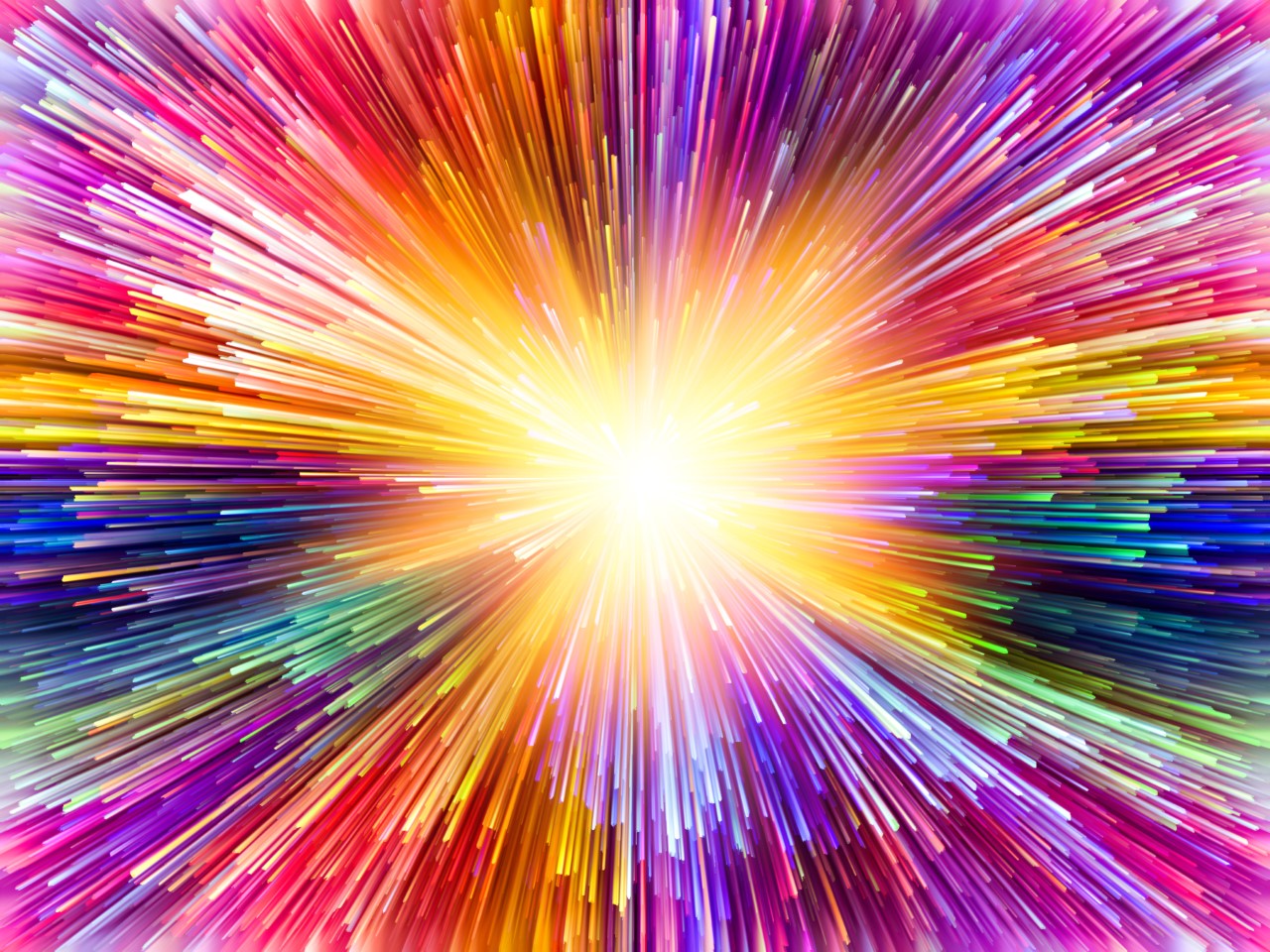
So, these colours reflect the qualities we need to ride out the storm of the pandemic and its consequences. As such, arguably this year the Pantone award’s spotlight on colour is shining more brightly than ever. Particularly on how colour is freighted with meaning and how different colours evoke different reactions and emotions. Mastering the psychology of colour is a key requirement in the advertising and marketing world and there is no shortage of research into the subject to guide them.
Hemphill’s A Note on Color-Emotion Associations said colour has a major influencing effect on consumer buying behaviour. It can be so important that it accounts for 85% of the reason a purchase is made. It is an essential tool in branding and choosing the six primary and secondary colours can boost sales.
Increasingly popular in creating a powerful visual presence are fluorescent versions of primary and secondary colours. Once used principally as highly visible colours on warning signage and industrial clothing, neon colours are now energising designs and injecting playfulness while delivering results that stand out.
In fact, UFO Green, Plastic Pink, and Proton Purple were named by stock photography supplier Shutterstock as the colours growing fastest in popularity in 2019 across web design, photography, and print. They also adopt some of the psychological traits of their related colours. Electric blue can feel calm and tranquil, much like regular blues, while neon pink takes on the fun and lively characteristics of pink.
Online logo creation platform Logaster also expects neon to be a popular trend in 2021 and recommends the use of light shades of red, orange, blue or green.
Creating electrifying designs that evoked positivity and energy were among the reasons neon was used in the vibrant, highly personalised Fedrigoni 365 calendar project. It was completed on a Ricoh Pro C7200x digital colour press. Digital printing is ideal for the production of a range of neon hues that can all be printed in the same print run. The colours were created with the Touch7 Extended Colour Gamut system which has over 700 colours from which to choose.
Colour undeniably plays a central role in influencing consumers’ reactions. Pantone knows it, marketers, graphic designers and the wider creative community knows it. 2021 will not be short of its challenges, so every lever that can be pulled to gain advantage must be pulled. Colour cannot be ignored – its power is there to be harnessed.
www.ricoh-europe.com