

 Ahead of World Gin Day, we’ve assembled a selection of stunning Gin label designs from across the globe.
Sun Set Gin by Sweety & Co – Brazil
Sunset Bar, named for its beautiful sunset views in Curitiba/Brazil, have recently launched their own Sunset Gin. Brazilian design company Sweety & Co were tasked with creating a visual identity that reflected the brand and stood out among category competitors.
The design draws upon the bar’s uniquely relaxed yet sophisticated aesthetic, reflected in the fresh and vibrant colour palette and minimal layout. The hero of the design, however, is the sunset itself. Using an art-deco approach, the sunset appears as a minimalist geometric form decorated in copper to accentuate the sunset light. Furthermore, Sweety & Co built a lettering-inspired design feature focusing on the letter ‘S’ which is used as a foundation for the composition.
The elegantly shaped slim bottle, more akin to packaging you’d find for bottled water, differentiates it from others on the market.
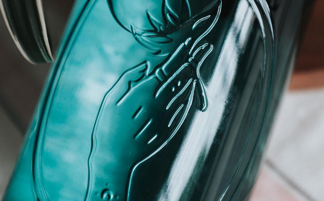
Monachus Gin by Bedow – Croatia
The tiny Monachus distillery sits at the tip of Croatia’s Istria peninsula, where the land dips into the shimmering Adriatic Sea. Every aspect of Monachus gin is defined by its sense of place, from its name borrowed from Monachus Monachus, the endangered Mediterranean monk seal that used to live on these coasts, to its botanicas taken from salt-flecked, pine-scented shores.
Swedish design studio Bedow draws on these core landscape elements in their label design. Each label takes on one of five shapes: the Bora wind, the waves, the salt in sea and air, a pebble from the shore, and a pinecone from the hills. The three-tone palette of black, white and either red, yellow or blue project a calm tranquillity that transports you to the peaceful shores.
Each bottle is hand stamped with a logomark comprised of a seal tumbling in the waves, as a nod to the endangered Mediterranean monk seal, and the minimal materials used are 100% plastic-free.
Condesa Gin by Swig and Schubert Studio – Mexico City
Condesa Gin is a new premium gin from Mexico City’s first micro-distillery. The distillery is run by a passionate all-female distilling team in the leafy neighbourhood of La Condesa, where old meets new, calm meets vibrance, and shade meets dappled sunlight. The gin is distilled with sustainably sourced, regional botanicals often used in traditional Curandera healing and spiritual rituals and ceremonies.
With this in mind, the package design by Swig and brand identity by Schubert Studio come together to convey the two worlds of old and new as well as reflect the unique characteristics of the distillery process and location. Swig’s bespoke apothecary-inspired bottles feature original glass embossing and custom acacia wood closures, with two extra dry gin expressions: the herbal, citrusy Clásica in blue-green glass and the sunny, floral Prickly Pear & Orange Blossom in pale pink glass.
The gold foil-stamped rustic labels feature Schubert’s illustrations of a woman and spiritual iconography complete with evocative typography, both of which capture the unique distillery’s team and distinctive methods.
Selva Gin by invade – Colombia
Selva Gin is Colombia’s first London Dry gin made with Colombian botanicals that give it its distinctive herbal backbone with prominent citrus notes. Established through a collaboration between two bartenders – one English, one Colombian – and a Colombian chef in partnership with Turicum Distillery in Zurich, Switzerland. The distillery is based out of Cartagena, Medellín and Barranquilla where it is possible to source fresh ingredients from all over Colombia from the cold altitudes of the páramo in the Andes to the tropical Caribbean coast.
Selva is made up of 14 botanicals, pure alcohol and born out of the infinite Amazon rainforest scenery. With this in mind, design studio, invade, developed a visual identity that encapsulates the mysticism and distinct qualities of the brand’s unique location. Illustrations adorn the label, featuring native tribes, some references to pre-Columbian goldsmithing and anthropomorphic creatures as well as drawings of the product’s main ingredients.
The artwork takes inspiration from French artist Henri Rousseau.
“We wanted to recreate his dreamlike perspective on the tropical forest, by drawing bushes that reveal our territory’s secrets and mysteries, in a label full of details, textures, colours and finishes.”
Island Gin by One Design – Great Barrier Island, New Zealand
Island Gin is crafted five hours off the coast of New Zealand in a small distillery on the remote Great Barrier Island. Distilled with 100% pure New Zealand base spirit, organic Macedonian juniper, hand foraged botanicals mostly grown on the Island and cut with water sourced from a 100-year-old island spring, the unique profile of Island Gin is led by locally harvested Island Bush Honey and Coriander.
When developing the brand and packaging, One Design had the challenge of simultaneously capturing the wild nature of the Island, whilst also embodying the sensibility of the category that would sit comfortably alongside other ultra-premium gins.
Working closely with OI Glass, the bottle is made using recycled sea glass from the Island itself. Its distinct markings and the circular label design take inspiration from the kina shell, found on the coastline of the Great Barrier Island.
The pale green colour, an organic result from the transition phase of the glass manufacturing process, works beautifully to further enhance the kina identity which is naturally green in colour. These raw muted colours are juxtaposed with a sculptured foil emboss which assists brand positioning in the ultra-premium space.
This particular design was a Pentawards 2020 Silver winner in the Beverages category.
Xamorfos Gin by Lettera7 – Italy
Xamorfos is an Italian gin born in the southwestern city of Salerno. Hand-worked with ten Italian and South-East Asian botanicals, Xamorfos is a new brand of gin that invites its consumers to come on a journey from a rowdy reality to an inner dream-like space.
Lettera7 utilises this lucid dream concept throughout the packaging design. The bottle shape is almost medicinal, reminiscent of tincture bottles filled with something mysterious. The loose label sits to one side of the bottle, creating a sense of unpredictability and its yellow underside features line illustrations that seem to warp and move when viewed through the liquid. Its yellow colour deceives the eye, giving the perception of pigment within the gin.
The label is supported by a system of rubber bands and can be removed from the bottle and framed. This aspect was designed as a project that could grow, eventually inviting other illustrators and artists to periodically create different artwork to feature on the inner label.
www.pentawards.com


